Friday, March 25, 2016

Lab 7: Digital Change Detection

Goals and Background

The purpose of this lab is to gain knowledge and skills in measuring and identifying change of LULC over a specified time period utilizing remotely sensed imagery.  I will be conducting a quick qualitative change detection method along with a quantifying post-classification changed detection method.  Additionally, I will be creating a model which will allow me to display the result of the change detection on a map.

Methods

All of the following step were performed in Erdas Imagine 2015.

Change detection using Write Function Memory Insertion

Utilizing Write Function Memory Insertion is a simple yet powerful method to detect changes between images of the same area from different time frames. The analyst simply opens the near-infrared bands from the two dates of imagery in the red, green, and blue color guns.  The pixles within the images which have changed will be displayed as a different color against those which remained the same.

For this section of the lab I utilized images of Eau Claire and surrounding counties provided to me by my professor Dr. Wilson.  I opened the an image containing the red band (band 3) from 2011 and then 2 images of near-infrared band of the same area from 1991.  The last step was to layer stack the images together.  I opened the layer stacked image in a viewer in Erdas to see the results (Fig. 1).
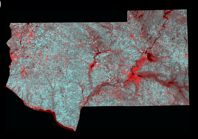
(Fig. 1) Results from performing Write Function Memory Insertion.  The bright red areas are where change has occurred in the images between the two dates.

Post-classification comparison change detection

For this section of the lab I will be conduction change detection of the Milwaukee Metropolitan Statistical Area (MSA) between 2001 and 2011.  I was provided previously classified images from my professor Dr. Wilson.

The first objective for this section of the lab is to quantify the change which has occurred in the Milwaukee MSA in hectares between the classified image from 2001 and classified image from 2011. I brought the two image in to separate viewers in Erdas (Fig. 2).

(Fig. 2) 2001 classified image (Left) and 2011 classified image (Right) of the Milwaukee MSA in Erdas.
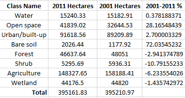
The next step was to obtain the histogram values from the raster attribute table and input the values in to an Excel spreadsheet with the proper classes (Fig 1).  The next step was to convert the histogram values to square meters and then to hectares.

(Fig. 3) Histogram values input in to Excel spreadsheet converted to Hectares.
Once the values were converted into Hectares I was able to calculate the percent of change for each class for the Milwaukee MSA area (Fig. 4).

(Fig. 4) Percent change between the 2001 and 2011 image of the Milwaukee MSA area.


The next step for this section of the lab is to develop a From-to change map from the two images.  I created a model to detect the change between the two images.  Within the model I will also create an image which displays the areas which have changed for the following classes.

  1. Agriculture to urban/built-up
  2. Wetlands to urban/built-up
  3. Forest to urban/built-up
  4. Wetlands to agriculture
  5. Agriculture to bare soil

I will be utilizing the Wilson-Lula algorithm to detect the change and create the display images.  The first step is to separate the individual classes using an "either or" statement.  The either or statement will create a image containing one class only, such as, agriculture areas and nothing else. Each separate class is grouped together to match the above list of five comparative classes.  The "either or" images was put into a temporary raster to save on storage space within the computer.  The next step was to use a Bitwise function to shows the areas which changed from one LULC class to another. The output from the function can be input on a map to display the areas of change.

(Fig 5) Model utilizing the Wilson-Lula algorithm.

Results


(Fig. 6) Map displaying the LULC change in the Milwaukee MSA area.
Sources

Homer, C., Dewitz, J., Fry, J., Coan, M., Hossain, N., Larson, C., Herold, N., McKerrow, A., VanDriel, J.N., and Wickham, J. 2007. Completion of the 2001 National Land Cover Database for the Conterminous United States.Photogrammetric Engineering and Remote Sensing, Vol. 73, No. 4, pp 337-341.

Xian, G., Homer, C., Dewitz, J., Fry, J., Hossain, N., and Wickham, J., 2011. The change of impervious surface area between 2001 and 2006 in the conterminous United States. Photogrammetric Engineering and Remote Sensing, Vol. 77(8): 758-762. 

Lab 6: Classification Accuracy Assessment

Goals and Background

The purpose of this lab is to gain knowledge and practice evaluating the accuracy of classifications performed on remotely sensed images.  Performing accuracy assessments is a mandatory post-processing step to classified images.

Methods

All of the following methods were performed in Erdas Imagine 2015.

I am performing the accuracy assessment on both my unsupervised and supervised classifications from lab 4 and lab 5.  The reference image is a high resolution image of the same area provided to me by my professor.

Performing accuracy assessment is done in two steps.  Generating ground reference test samples is the first step.  Utilizing the test samples to perform the accuracy assessment is the second step.  I will be performing the accuracy assessment on my unsupervised image first.

Generating Ground Reference Test Samples

Opening the classified image into the first viewer and the reference image in a second viewer is the first step of the process.  To open the accuracy assessment window activate the first viewer, select Accuracy Assessment from the Raster tab and Supervised sub-tab. Open the classified image into the accuracy assessment window.  Clicking the Select Viewer icon and clicking anywhere in viewer 2 designates the image as the reference for the assessment.

Next, you have to generate random points to assess the accuracy from.  Selecting Create/Add Random Points from the Edit menu opens the Add Random Points window.  I set the Number of Points to 125, the Distribution Parameters to Stratified Random, the number of minimum points to 15 and selected the 4 classes from my unsupervised classification (Fig. 1). The reference image is now populated with 125 sample points also with the Accuracy Assessment window.

(Fig. 1) Parameters set and the classes selected to generate the random points.
With all of the information input now you can begin performing assessment.  Selecting the first 10 random points and selecting Show Current Selection from the View menu hides all of the random points except for the first 10.  Using the same number scheme from the previous lab I zoomed into each point to identify the LULC class and input the number into the Reference column for each point (Fig. 2). You will notice the sample point changes from a white color to a yellow color after filling in the Reference column (Fig. 3). Complete the same step for all 125 points in the list.

(Fig. 2) Evaluating the sample point for LULC class and entering in the value in to the Reference column.

(Fig. 3) Random sample points # 31, 32, 34, 36 turned yellow after entering the value in the Reference column. Random sample points #40, and 39 are still white as the value has not been entered in to the Reference column.

Generating the Accuracy Assessment Report

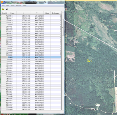
Select Accuracy Report from the Reports menu to generate the assessment report (Fig. 4).

(Fig. 4) One page of  the accuracy assessment report for the unsupervised classification from Erdas .  This report is over 17,000 lines long, and the above image displays on 60 of the lines.
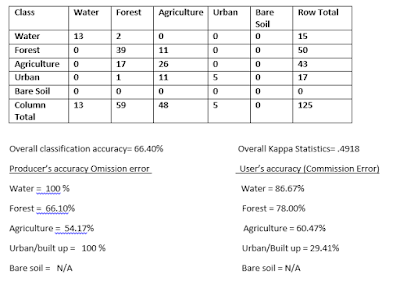
I complied the results from the report into a Excel spreadsheet and added additional information in a Word document to be able to better view the results (Fig. 5).  The results for the agriculture and urban/built up areas was not at an adequate level to utilize the classification for anything.

(Fig. 5) Compiled data from the accuracy assessment report in an Excel/Word document.  

I ran in to a software glitch when performing my accuracy assessment on the supervised classification.  The report would run but was not labeled properly and did not produce any Kappa statistics.  After consulting with my professor, he determined an error occurred between the algorithm and the newest version of the software.  At this time I am unable to produce any results from my supervised classification.

Sources
High resolution image is from United States Department of Agriculture (USDA) National Agriculture Imagery Program.

Landsat satellite image is from Earth Resources Observation and Science Center, United States Geological Survey.


Wednesday, March 9, 2016

Lab 5: Pixel-based Supervised Classification

Goals and Background

The main purpose of this lab is to gain an understanding of pixel-based supervised classification to produce and land use/land cover (LULC) display.  I as the analyst will be extracting biophysical and sociocultural information from remotely sensed images to perform the classification.  I will be developing my skills in selecting and evaluating training samples to be used in supervised classification. Producing an useful display of the land use/land cover classes will be my final step in the lab.

Methods

All of the following sets were performed in Erdas Imagine unless otherwise stated.

I will be performing supervised classification on the same image of Chippewa and Eau Claire county from my previous blog post to which I performed unsupervised classification to.

Utilizing supervised classification requires more user input in the beginning from the analyst compared to unsupervised classification.  However, when creating the classes supervised classification requires little to no input from the analyst.

Designing a categorized outline for your fields is the first step in creating a classification. For this image I will be classifying the image into the following 5 categories:

  1. Water
  2. Forest
  3. Agriculture
  4. Urban/Built Up
  5. Bare Soil

Collecting training samples is the next step in supervised classification.  I will be gathering spectral signatures to create the training samples to classify the image. I will be collecting multiple training samples from each class as no feature in a LULC has the same spectral signature. I will be using the Signature Editor (Fig. 1). (For more information about collecting samples the Signature Editor see my previous blog post on collecting spectral signatures.)  Making sure you are collecting a sample from one form of LULC is essential to collecting an accurate training sample.  For example you can not collect one sample from an area which contains a soy bean field and a corn field.  Though both types of the fields would fall under the agricultural LULC having a mixed training sample with affect your final results. I utilized the Google Earth Sync feature as I have in the past few blogs to assist me in identifying LULC class areas.


(Fig. 1) Collecting training samples using the Signature Editor.
I collected between 12-20 samples per LULC class.  When I felt I had a good distribution across the image and had collected samples from the majority of the different surfaces I ceased taking samples for the particular class.  I collected a total of 83 signatures across all of the LULC classes when I finished collecting samples.

Evaluating the quality of training samples.

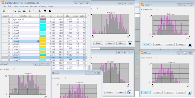
The next step is to evaluate the quality of the training samples I collected.  Examining all the spectral signatures of one class in the Signature Mean Plot window viewer gave me an overview of all the signatures in a class (Fig. 2).  Examining the displayed plots shows a pattern or trend between the spectral signatures.  Additionally, the displayed plots display signatures which do not follow the same pattern.  Within Fig. 2 I have displayed the signatures which do not follow the pattern in gold.


(Fig. 2) Display of spectral signatures for the urban samples I collected.  Signatures following the correct patter are in aqua and the questionable signatures are displayed in gold.

I needed to examine the histogram display for all the bands of the signature for the each questionable samples individually.  The examination of the histogram will help me to determine if the sample can be utilized as a training sample.  When analyzing the histograms I was looking to see if more than 4 of the histograms from each sample were multimodal (Fig. 3). If more than 4 of the histograms were mulitmodal then the sample must be deleted and not utilized in the supervised classification. Four or more multimodal histograms tell the analyst he/she collected a sample from more than one type of land cover such as a soy bean field and a spruce forest.


(Fig,. 3) Display of a sample with all the histograms from all the bands being multimodal.
Having the one histogram from all the bands displayed as multimodal is acceptable and the signature can still be utilized for supervised classification (Fig. 4).
(Fig. 4) Display of a sample with all but one histogram from all the band being non-multimodal.
After eliminating the signatures which were not accurately collected I displayed all of he signature on one Spectral Mean Plot window (Fig. 5).  I was left with 77 signatures when I completed deleting the erroneous results.

(Fig. 5)  Spectral Mean Plot window with all of the remaining signature plots.

The next step in the accuracy assessment is to assure the five informational class signatures do not overlap in more than four bands.  I performed a separability analysis to assess which bands will give me the best spectral separability.  Selecting Separability from the Evaluate tab opened the Signature Separability window (Fig. 6).  I changed the Layers Per Combination to 4 and the Distance Measure to Transformed Divergence and left the other settings alone and ran the evaluation.

(Fig. 6) Signature Separability settings window in Erdas Imagine. 

A report is generated when the evaluation is complete (Fig. 7).  Scrolling down a number of pages will bring you to the a list of the four bands which have the best average separability based on the collected signatures.  Then the Best Average Separability value is listed after the four bands. The Best Average Separability value should be above 1900 to have good separability.  Excellent separability is a score above 2000.  Any score below 1700 is in accurate and training samples need to be collected again in a more accurate manner.  Bands 1,2,4,5 are the bands with the best separability and my Best Average Separability value is 1960 for my signatures I collected.

(Fig. 7) Separability report, with bands 1,2,4,5 having the best separability and  Best Average Separability value of 1960.
Merging the individual signatures for each informational class to form one signature for that class is the final step before running the supervised classification.  Highlighting all of the signatures for one class and selecting Merge from the Edit menu will produce a single signature to represent the class. I repeated this step for all of the classes.  I deleted all of the individual signatures which left me with 5 spectral signatures in the Signature Editor window (Fig. 8). I saved this signature file for use in the classification.

(Fig. 8) Signature Editor window with 5 classes after merging the individual signatures into one signature.
Plotting these results in the Signature Mean Plot window makes it easier to see the separability between the bands (Fig. 9).

(Fig. 9) Signature Mean Plot of the merged spectral samples.
Performing supervised classification

Performing the supervised classification is very simple once all of the preparation work is completed. Selecting Supervised Classification from the Supervised sub-tab from the Raster menu will open up the classification settings window (Fig. 10).  The Input Raster File is the base satellite image, and the Input Signature File is the signature file I save from the Merge operation above.  The Classified File  is your output image/classification.  I did not change the default settings under Decision Rules and proceeded to run the supervised classification.  

(Fig. 10) Supervised Classification settings window.
Results


(Fig. 11) Display of my supervised classification results.

The results from the supervised classification are more accurate than the unsupervised classification from the last weeks lab for all the areas except the Urban areas.  Many agricultural fields and bare soil areas were given labels of Urban areas.  The extensive variation between urban surfaces makes it the most difficult class to properly classify.  I am certain more diverse training samples from urban areas would lead to more accurate results.

Sources

Lta.cr.usgs.gov,. (2016). Landsat Thematic Mapper (TM) | The Long Term Archive

Thursday, March 3, 2016

Lab 4: Unsupervised Classification

Goals and Background

The purpose of this lab is to develop the analyst skills in extracting biophysical and sociocultural information from remotely sensed images.  The analyst will be employing an unsupervised classification algorithm to perform image classification.  Additionally, the lab will  help develop the analyst skills in recoding multiple spectral clusters from the unsupervised classification into a thematic map displaying land use/land cover classes.

Methods

All of the following methods were performed in Erdas Imagine 2015 unless otherwise stated.

Experimenting with unsupervised ISODATA classification algorithm 

In the first section of the lab I will be using the Iterative self-organizing data analysis technique (ISODATA) classification algorithm as the first step in reclassifying and image of Eau Claire and Chippewa counties in Wisconsin.  I will be reclassifying the image to the type of land use/land cover throughout the study area.

From the Raster menu I opened Unsupervised Classification from the Unsupervised sub-menu after open the subset image of Eau Claire and Chippewa county provided to me from my professor (Fig. 1).  From the Unsupervised Classification menu I set a number of the parameters with in the window. First I change the Method to Isodata which allowed me to alter the # of Classes 10 (from & to).  This allow the classification scheme to only produce 10 classes.  Then I changed the Maximum Iterations to 250.  Changing the Maximum Iterations allows the algorithm to run up to 250 times to properly group like features together.  I left all of the other parameters alone and proceeded to run the classification tool.

(Fig. 1) Unsupervised Classification window with parameters set.

Running the classification tool does not produce a output which can easily be understood (Fig. 2).  The analyst must recode the unsupervised clusters into meaningful land use/land cover classes. 

(Fig. 2) Display with orginal image (left) and unsupervised classification output image (right)

I will be classifying the land use/land cover to the following display:
  • Water = Blue
  • Forest = Green
  • Agriculture = Pink
  • Urban/built-up = Red
  • Bare Soil = Sienna

I utilized Raster Attribute Table found under the Show Attributes tool under the Table tab to access the color table for the 10 classification clusters for the image (Fig. 3).  From this window I sync my view to Google Earth and started comparing the location on my image to the same location on Google Earth.  I made several comparisons throughout the image as I tried to decide which land use/land cover best described the cluster then selected and set the appropriate color to be displayed.  I utilized this same method to set the appropriate color to all 10 of the clusters.
(Fig. 3) Show Attribute tool window in Erdas Imagine.
Improving the accuracy of unsupervised classification

The accuracy of the previous unsupervised classification is limited due to the number of  classes set in the parameters.  The algorithm has group similar spectral signatures together though they would be classified in different classes.  Expanding the number of classes will allow a narrower amount of variability between the class clusters thus allowing different land use/land covers to be better represented in the display image.

To improve the accuracy I changed the number of classes to 20 and reduced the Convergence Threshold to .92.  The rest of the parameters were left the same and the unsupervised classification was ran.  I utilized the same method to recode the output image from the classification.

Recoding LULC classes to enhance map generation

The final step of my lab is to produce a map of the land use/land cover (LULC) for Chippewa and Eau Claire counties in Wisconsin from the unsupervised classification with 20 classes.  Before creating a map I need to recode the 20 classes to 5 classes.  One does not want to display 20 classes in a legend with a number of those 20 classes being duplicate classes (colors).

I utilized the Recode tool found under the Thematic tab to access the recode window (Fig. 4).  The class numbers were as follows:

  1. Water
  2. Forest
  3. Agriculture
  4. Urban/Built up
  5. Bare Soil
The same color scheme was applied to the new recode utilizing the Raster Attribute Table as in previous steps.

Results

You can see the most noticeable difference between the forest and agricultural area when comparing the results from the unsupervised classification with 10 classes and 20 class.  I had a tough time separating (representing) the smaller forest and small agricultural areas with the unsupervised classification with 10 classes. While the 20 classes did help the representation there were still areas which overlapped and are not perfectly represented.

(Fig. 4) Unsupervised Classification recoded results with 10 classes (Left) and 20 classes (Right)


(Fig. 5) Map created to display the LULC for Chippewa and Eau Claire County in Wisconsin from the 20 class unsupervised classification.


Sources

Lta.cr.usgs.gov,. (2016). Landsat Thematic Mapper (TM) | The Long Term Archive