Thursday, February 25, 2016

Lab 3: Radiometric and Atmospheric Correction

Goals and Background

The main purpose of the lab is to provide me (the student) practical experience correcting atmospheric interference on remotely sensed images.  The first objectives of this lab will have me performing atmospheric correction using multiple methods on remotely sensed images.  The second objective of the lab will have me performing relative atmospheric correction on remotely sensing images.

Methods

All of the following methods were performed in ERDAS Imagine 2015 unless noted.

Absolute Atmospheric Correction Using Empirical Line Calibration

The first part of the lab I will be conducting Empirical Line Calibration (ELC) to correct atmospheric interference on a Landsat 5 TM image of Eau Claire, WI and the surrounding area.  To perform ELC to correct remotely sensed images you need in situ spectral reflectance measurements from the same time the image was collected.  The majority of in situ data is not available for older or even present day data.  Performing ELC is still possible through the use of spectral libraries to obtain in situ data for some of the surfaces within the image.  I do not have any in situ data from the day and time my image was collected so I will be consulting a spectral library to perform my ELC correction.  I was provided the ELC equation by my professor (Fig. 1).

(Fig. 1) Empirical Line Calibration equation.
In order to perform ELC I will be utilizing the Spectral Analysis Work Station which is found under the Raster tab and the Hyperspectral sub-tab.  Once my image was added to the work station, I changed the band combination from true color (3,2,1) to false color infrared (4,3,2) (Fig. 2).


(Fig 2.) Spectral Analysis Work Station with image displayed in false color infrared (4,3,2)
For the next step I opened the Atmospheric Adjustment Tool window and changed the method tab to Empirical Line.  We will be using the ASTER spectral library for the correction of this image. The first task is to collect a spectral sample of a asphalt road surface from my image.  I zoomed in the image to an area I was familiar with and used the Create a point selector to select the center of a roadway. After collecting the sample I searched through the ASTER library and found Asphaltic concrete which I had to click and drag on to the Spectral Plot graph below the list (Fig. 3).

(Fig. 3) Atmospheric Adjustment Tool window with Sample and Reference sample selected.
Next I added a few more samples from a forested area, agricultural land, metal roof, and a lake selecting a different color for each sample.  I added spectral library samples (Pine Wood, Grass, Alunite AL 706 Na, and tap water) which were the best available matches in the library for my sample selections.

Once all of the samples have been entered the Spectral Analysis Workstation calculates a regression equation for each of the bands.  Once I save the regression information I closed out the Atmospheric Adjustment Tool and run the Atmospheric Adjustment from the Spectral Analysis Workstation window.  After the tool completes I opened up the corrected image file to compare the results to the original uncorrected image (Fig. 14).

Absolute Atmospheric Correction Using Enhanced Image Based Dark Object Subtraction

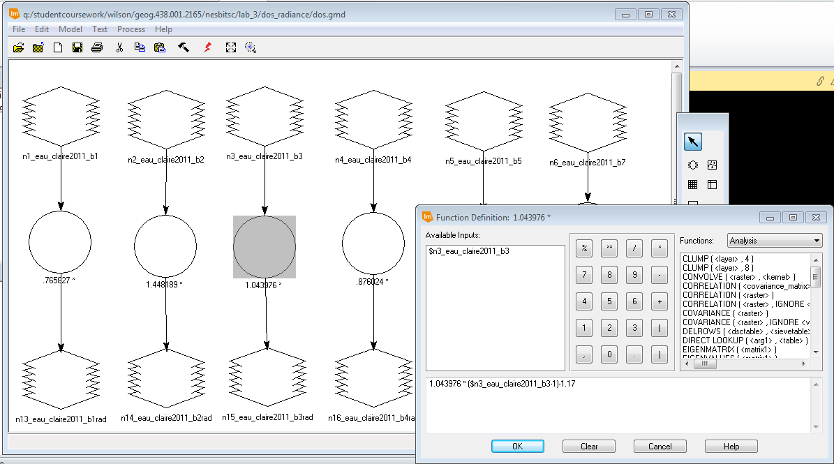
During this section of the lab I conducted a different form of Absolute Atmospheric Correction called Dark Object Subtraction (DOS).  The DOS uses a number of parameters including: sensor gain, offsetm solar irradiance, solar zenith angle, atmospheric scattering, absorption, and path radiance to correct for atmospheric interference.

The first step for DOS is to convert the satellite image to at-satellite spectral radiance using a given formula (Fig. 5).  All of the values for the formula are found within the metadata of the image.

(Fig. 5) Formula to convert a satellite image to at-satellite spectral radiance.
I needed to calculate the at-satellite spectral radiance for all 6 bands of the same Landsat 5 TM image. I started within the above atmospheric correction.  I utilized model builder to create a model to run the formula on all 6 bands at the same time (Fig. 6).  This process is exactly the same as correcting the thermal band images from Lab 2 where I converted the image values to at-satellite radiance except the formula is altered slightly for spectral radiance.
(Fig. 6) At-satellite spectral radiance conversion model.


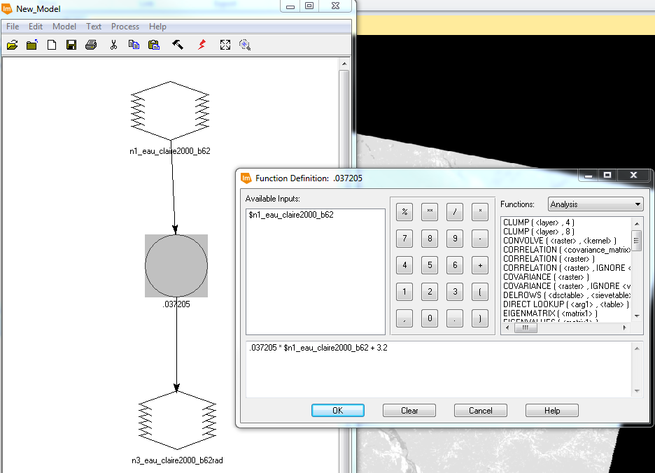
Next, I then had to convert the at-satellite spectral radiance to true surface reflectance using a given formula (Fig. 7).  The distance between the Earth and sun value was obtained from a supplied chart from my professor. Path radiance is the distance from the origin of the histogram and the actual beginning of the histogram in the metadata chart found in Erdas. The TAUv value is approximated as 1 because the satellite image was collected at nadir.   The Esun value was obtained from a chart provided by my professor.  The sun zenith angle is calculated by subtracting the sun elevation angle which is obtained from the metadata from 90.  The TAUz value was improvised and approximated from an average value chart.  I utilized model maker in Erdas to apply the formula to each image band from step one (Fig. 8).

(Fig. 7) Formula to convert image from at-satellite spectral radiance to true surface reflectance.
(Fig. 8) Conversion from at-satellite spectral radiance to true surface reflectance model.

With six output images from the previous step I completed a layer stack of the corrected band images to produce and image to compare to the original (Fig. 14).

Relative Atmospheric Correction Using Multidate Image Normalization

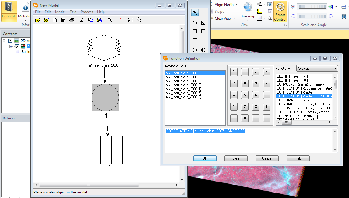
 This section of the lab will have me performing Relative Atmospheric Correction using Multidate Image Normalization on a 2009 image of Chicago and the surrounding area from a base image collected in 2000.  The first step in performing Multidate Image Normalization requires you to collect radiometric ground control points from the base image and the image to be corrected.  I collected 15 sample points from both images in matching locations from various surface types using the Spectral Profile tool in Erdas (Fig. 9).

(Fig. 9) Spectral profile chart results for sample points in both images.


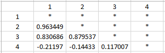
Then I opened the the Tabular Data from the Spectral Profile window.  From this window I collected the Mean Pixel value for each band layer from each spectral sample point.  I copied all the values into an Excel spreadsheet (Fig. 10).  With in Excel I was able to create a scatter plot containing the values of each band from both the base image the to be corrected.  I was able to add a Trendline to with the (regression) Equation and R-squared value on the scatter plot (Fig. 11).  After making sure my R-squared value was above .85 I was able to create a model utilizing the regression equation from each band to correct the 2009 image (Fig. 12).  After running the model I had to utilize the layer stack feature to create an output image to compare to the original (Fig. 15).

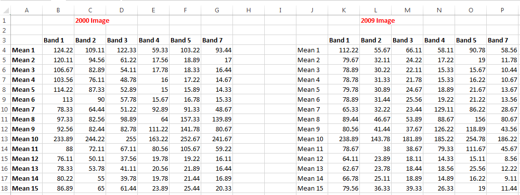
(Fig. 10) Mean pixel values for the spectral sample separated by band in Excel.
(Fig. 11) Scatter plots with regression equation and R-squared value created in Excel for each band.
(Fig. 12) Model utilizing the regression equation from the scatter plots create in Excel.


Results

(Fig 13) Uncorrected Landsat 5 TM image (Left) ELC corrected image (Right).

(Fig. 14) Uncorrected Landsat 5 TM image (Left) DOS corrected image (Right)
(Fig. 15) Uncorrected Chicago area image (Left) Multidate Image Normalization correction (Right)
Sources

Landsat.usgs.gov,. (2016). Landsat. from http://landsat.usgs.gov/

Thursday, February 11, 2016

Lab 2: Surface Temperature Extraction from Thermal Remote Sensing Data

Goals and Background

The main purpose of this lab is to learn the proper skills of extracting land surface temperatures from thermal bands of various satellite images.  In this lab I will be visually identifying variations in land surface temperature and utilizing models to convert the Digital Number (DN) to at-satellite radiance and at-satellite radiance to blackbody surface temperature across various collected satellite images.

Methods

All of the following methods unless noted were performed in Erdas Imagine 2015.

Visual Identification of Relative Variations in Land Surface Temperature

The first task of the lab was to compare tonal differences between band 61 (high grain) and band 62 (low grain).  You can see in (Fig.1) there are only slight variations between the two bands.  Band 61 has lighter tones or appears to be more washed out and contrast less between the dark and light tones.  Band 62 has greater variation in the tones and it more easily understood by the reader.  The darker the tone the cooler the surface temperature.

(Fig. 1) High Grain Band 61 (Left) & Low Grain Band 62 (Right) ETM+ images

When obtaining thermal satellite images the values are stored as a Digital Number (DN).  Converting the DN to kinetic (true) surface temperature requires a three stage process.  The first step is to convert the DN to "at-satellite radiance".  This step removes outgoing atmospheric interference from the image. The formula to achieve to conversion is Grescale * DN + Brescale.

Conversion of Digital Numbers (DN) to at-satellite radiance

The first step in the process is to calculate the Grescale.  To calculate Grescale you need to obtain LMAX, LMIN, and QCALMAX, and QCALMIN from the metadata of the image. The formula to calculate Grescale is (LMAX-LMIN)/(QCALMAX-QCALMIN).

The second step to identify Brescale which is equal to LMIN.

The final step is to input the previous information into the formula (Grescale * DN + Brescale).

To practice this process I utilized the band 62 image from the Visual Identification section.

I consulted the metadata and proceeded to calculate Grescale and identify Brescale which allowed be to create a model utilizing the final formula to convert the image from DN to at-satellite radiance (Fig. 2)

(Fig. 2) Formula input into model to convert original image to at-satellite radiance.


Conversion of At-Satellite Radiance to Blackbody Surface Temperature

The next step to obtain kinetic temperatures is to apply another formula to the image create in the previous step.  The formula results in at-satellite temperatures in kelvin = K2/LOG (K1/Previous Image +1).  I was provided K1 and K2 in a chart by my professor (Fig. 3).  I created a model utilizing the formula to convert the previous image from at-satellite radiance to Blackbody surface temperature (Fig. 4).

(Fig. 3) K1 and K2 chart.

(Fig. 4)  Formula input into model to converting at-satellite image to blackbody surface temperature.

Conversion of Radiant Temperature to Kinetic Temperature.

The last step to converting the original satellite image to kinetic temperature is to calculate emissivity and enter it into another formula (Fig.5).  I will not be performing this calculation during this lab assignment.

(Fig. 5) Radiant temperature to kinetic surface temperature conversion formula.

Complex Models

The next step in my lab was to take the simple models I had created in the previous steps and combine them into one complex model.  The complex model will allow me to preform both calculations in one model which will result in one final output.  I was given 2 images to hone my skills on.  I will be displaying my methods for the Landsat 8 image (Fig 6).  I need to perform the same processes to the image as before.  However, the data is displayed a bit different in the metadata and I will be utilizing band 10 from Landsat 8 instead of 6 like the ETM+ image.

(Fig. 6) Original band 10 image from Landsat 8.

The first step was to create a subset section of the image.  I was give an AOI to create the subset from.  To see the steps require to create a subset see my previous blog post.


Next I consulted the metadata and obtained all of the information needed to calculate Grescale. Instead of obtaining LMIN, I had to look for RADIANCE_MINIMUM_BAND_10.  Additionally, I had to look for QUANTIZED_CAL_MIN_BAND_10 instead of QCALMIN. The previous terms are interchangeable.  The same went for the "max" values for both L and QCAL.

With all the necessary information I created my model to calculate at-satellite radiance and convert the result to blackbody surface temperature. (Fig. 7).  One of the advantages of creating a complex model is in calculating the Grescale you can set the output to a temporary raster file and then apply the second formula and obtain my output.  This will help reduce unneeded files on the computer.  From the temporary file I applied the formula to calculate blackbody surface temperature.  With a simple click of the run button in the model builder I had completed both calculation with one streamlined process.

(Fig. 7) Complex model created for Landsat 8 image.

(Fig. 8) Formula calculation at-satellite radiance.


(Fig. 9) Formula calculation to convert at-satellite radiance to blackbody surface temperature.


After running the model I opened the .tif file in ArcMap and created a map to display my results (Fig. 10).  I changed the symbology and classification scheme to allow for better interpretation of the image.

Results


(Fig. 10) Map display of subset image and blackbody surface temperatures.

Thursday, February 4, 2016

Lab 1: Image Quality Assessment and Statistical Analysis

Goals and Background

The purpose of this lab develop skills in identifying and removing data redundancy between satellite image bands.  I will be extracting and utilizing statistical information to perform analysis to aid me in identifying data redundancy.

Methods

All of the following methods will be performed in Erdas Imagine 2015.

There are multiple methods to determine the quality of an image.  During this lab I will be creating "Feature Space Plot" and also performing "Correlation Analysis" to identify data redundancies between two image bands.

Feature Space Plot

Feature space plots display a comparison of data values for two bands of an satellite image.  The resulting graphic plot will allow me to determine the bands in a multispectral or hyperspectral image which can be utilized for the most efficient image classification.

I selected the Raster tab, then selected Supervised, and lastly selected Feature Space Image which opened up the create feature space image window.  I input the image I desired to run the tool on and created and output file for the results.  After running the tool I was able to open all 15 of the feature space plots for the TM image I was given (Fig. 1).


(Fig. 1) Display of all the feature space plots for a TM satellite image for bands 1,2,3,4,5,7.

Correlation Analysis

Correlation analysis is another method of analyzing data quality and preventing data redundancies.  The method of correlation analysis is the most effective method to determine high correlation between 2 bands withing the satellite image.

To perform correlation analysis I used model builder in Erdas to run the predefined correlation function with the inputs for the images I was instructed to run the analysis on (Fig. 2).  The output of this function is a table of values displaying the correlation between all of the band values.  If the value between two bands is >.95 it has a high correlation and myself as the analyst have to decide if I am going to keep both of the bands or if I am able to eliminate one of the 2 bands based on the objective of the research being conducted.  I ran image correlation for 3 different images (1 TM and 2 Quickbird images) which are displayed in the results section below.

(Fig. 2) Setup using model builder to run image correlation.


Results

When analyzing feature space plots for correlation analysis I was looking at the distribution of the brightness values. When the feature space plot has a narrow distribution it tells me the 2 bands being compared have a high correlation (Fig. 3)  When the feature space plot has a wide distribution it tells me the 2 bands being compared have a low correlation (Fig. 4).

(Fig. 3) Feature Space Plot displaying high correlation between 2 bands of a satellite image.

(Fig. 4) Feature Space Plot displaying low correlation between 2 bands of a satellite image

After running correlation analysis for an TM image for the Eau Claire, WI the table displayed a correlation right on the edge of being high between bands 2 and 3 (Fig. 5).  Depending on the purpose of the analysis I may choose to eliminate either band to reduce the redundancy of data.

(Fig. 5) Correlation Analysis for Eau Claire TM image from my lab assignment.

I ran correlation analysis on the 2 Quickbird images I was given for my lab and found a high correlation between band 1 and 2 for both of the images (Fig. 6 & 7).  For the image in the Florida Keys I would choose to eliminate band 2 as there is a over abundance of water in the Florida Keys area which make band 1 (blue) more useful.
(Fig. 6) Correlation Analysis table for Florida Keys Quickbird image from my lab assignment.
The Bangladesh image was comprise mostly of earth and vegetation cover so I would choose to eliminate band 1 (blue) so I could utilize the band 2 (green) to help decipher variations in vegetation from the image.
(Fig. 7) Correlation Analysis table for Bangladesh Quickbird image from my lab assignment.
Sources

Landsat satellite image is from Earth Resources Observation and Science Center, United States Geological Survey.

Quickbird high resolution images are from Global Land Cover Facility at www.landcover.org